- Logo")
Focus on Topic: The Psychedelic Poster Art and Artists of the late 1960s
- 04/03/2023
- Ted Bahr, Bahr Gallery New York, USA

The stylistic trademarks of the 1960s psychedelic poster were obscured and disguised lettering, vivid color, vibrant energy, flowing organic patterns, and a mix of cultural images from different places and periods -- anything to confuse, enchant, thrill, and entertain the viewer. The style was also tribal in the sense that if you could decipher and appreciate these posters then you were truly a member of the hippie subculture – you were hip, man.
The psychedelic poster movement coincided with the rise of hippie culture, the use of mind-altering drugs like LSD, and the explosion of rock and roll. San Francisco was the center of this universe, and while prominent psychedelic poster movements also developed in London, Detroit, Los Angeles, and Austin, Bay Area artists both initiated and dominated the genre.
San Francisco had long-been a center of Bohemian culture. In the 1950s and early 60s, the Beat Generation blossomed in the city’s North Beach neighborhood, home to a multitude of jazz clubs and the infamous City Lights bookstore. Meanwhile, 40 miles south at Stanford University, the CIA was experimenting with LSD and other psychoactive drugs. Two of their volunteers were future Grateful Dead members - lyricist Robert Hunter and the writer Ken Kesey. Kesey would go on to organize a number of events in late 1965 and early 1966 called “Acid Tests” -- freeform collages of music, movies, dance, recording, performance art, and light shows fueled by LSD. In January 1966, a Trips Festival produced in San Francisco by Kesey and Stewart Brand was attended by 6,000 people. The movement was gaining momentum fast.

Meanwhile, Bill Graham had promoted several benefit concerts for the San Francisco Mime Troupe that were similar to Kesey’s “Acid Tests.” Graham saw an opportunity to bring the nascent psychedelic bands into concert halls – specifically the Fillmore Auditorium, which he began renting every other weekend to produce “dance concerts.” Another promoter, Chet Helms of The Family Dog, also rented the Fillmore for rock shows in early 1966, presenting bands like the Jefferson Airplane, Grateful Dead, and Big Brother and the Holding Company, featuring a young Janis Joplin.
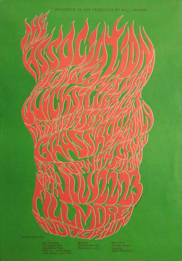
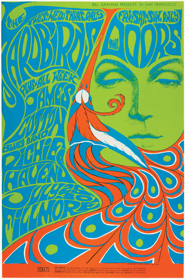
To advertise these concerts, both promoters turned to Wes Wilson at Contact Printing, who had been laying out the primitive handbills used to advertise the Mime Troupe Benefits and the Trips Festival. Wilson took LSD at the Festival and was impacted by the music, the scene, and the sensuous free-love sensibilities of the hippie ethos. His posters quickly evolved to match the flowing, tripping, improvisational nature of the developing psychedelic music -- or “acid rock” -- and his lettering began to protrude, extend, and squeeze into every available space, mimicking and reflecting the totality of the psychedelic experience. His early style culminated in the July 1966 poster for The Association which featured stylized flame lettering as the image itself, a piece that Wilson considered to be the first truly psychedelic poster.
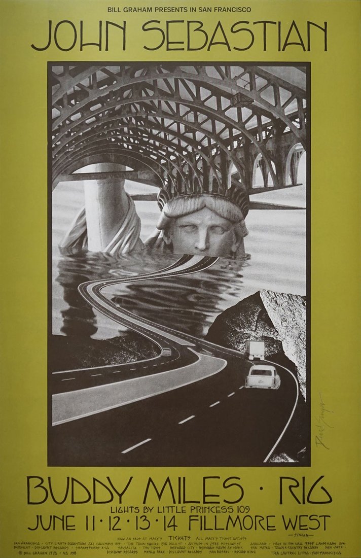
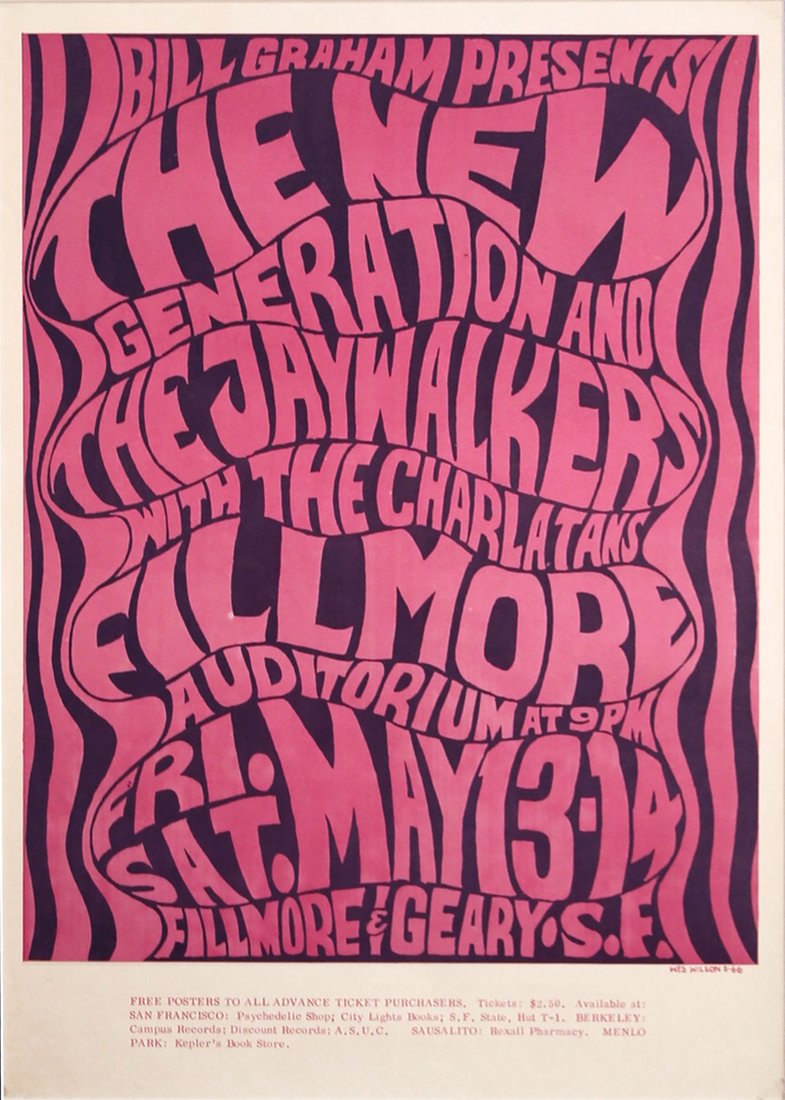
By the fall of 1966, Wilson had developed his own inscrutably psychedelic typeface inspired by the lettering style of Viennese Secessionist Alfred Roller. Wilson altered Roller’s style to fit his own vision, rendering the characters with almost indistinguishable similarity by expanding their outlines and inset shapes, while concurrently employing the sensuous, organic forms and images found in Art Nouveau. The October 1966 poster for “The Sound” would become Wilson’s most iconic work, with a free-flowing, powerful, and uninhibited nude dancer as its central image. While Wilson is generally considered the Father of the Psychedelic Poster, by late spring 1967, a dispute over money led to a falling-out with Graham, and he was replaced by Bonnie MacLean.
The hippie subculture – you were hip, man.

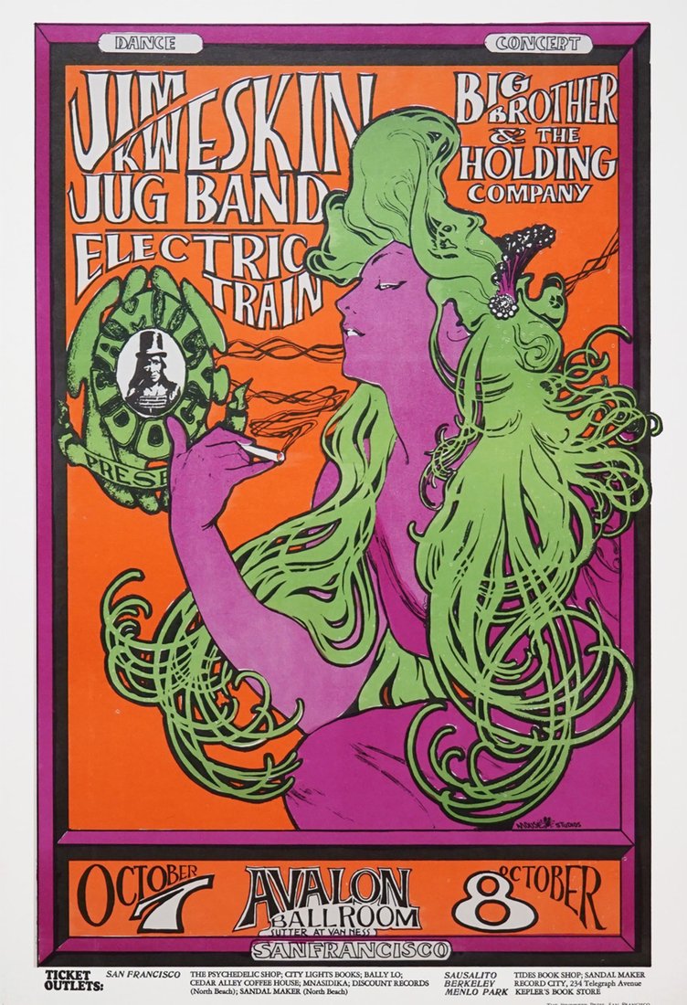
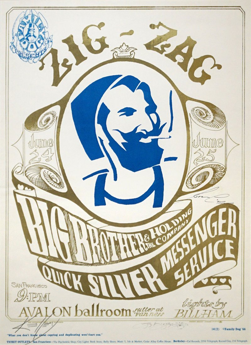
Meanwhile, Chet Helms had been using the team of Stanley Mouse and Alton Kelley to create posters for shows at the Avalon Ballroom. Mouse, trained at the Detroit Society of Arts and Crafts, was an illustrator with a background in hot-rod graphics, while the self-taught Kelley’s strength was collage. The two formed Mouse Studios, and the pair would frequent the San Francisco Public Library looking for images they could employ in their poster-making. "Stanley and I had no idea what we were doing," Kelley told the San Francisco Chronicle in 2007, "but we went ahead and looked at American Indian stuff, Chinese stuff, Art Nouveau, Art Deco, Modern, Bauhaus, whatever. We were stunned by what we found and what we were able to do. We had free rein to just go graphically crazy. Before that, all advertising was pretty much just typeset with a photograph."
The work of Mouse and Kelley has come to be recognized as a 20th-century American counterpart to the French poster art of Henri de Toulouse-Lautrec during the Belle Époque, although the two psychedelic artists never imagined that they were creating anything of enduring value, anything more than another crazy poster for that week's Avalon show. "We were just having fun making posters," said Mouse. "There was no time to think about what we were doing,” said Mouse. “It was a furious time, but I think most great art is created in a furious moment."
Mouse and Kelley were the main drivers behind the use of everyday commercial images in concert posters, and their June 1966 poster for Big Brother included a large picture of the Zig-Zag rolling paper man as well as the following disclaimer: “What you don’t know about copying and duplicating can’t hurt you.” Mouse and Kelley also borrowed other images for some of their most iconic posters: an Edward Joseph Sullivan illustration for the Grateful Dead “Skeleton and Roses” poster in September 1966, and October 1966’s “Woman with Green Hair,” where they psychedelicized one of Alphonse Mucha’s Job Rolling Paper girls.
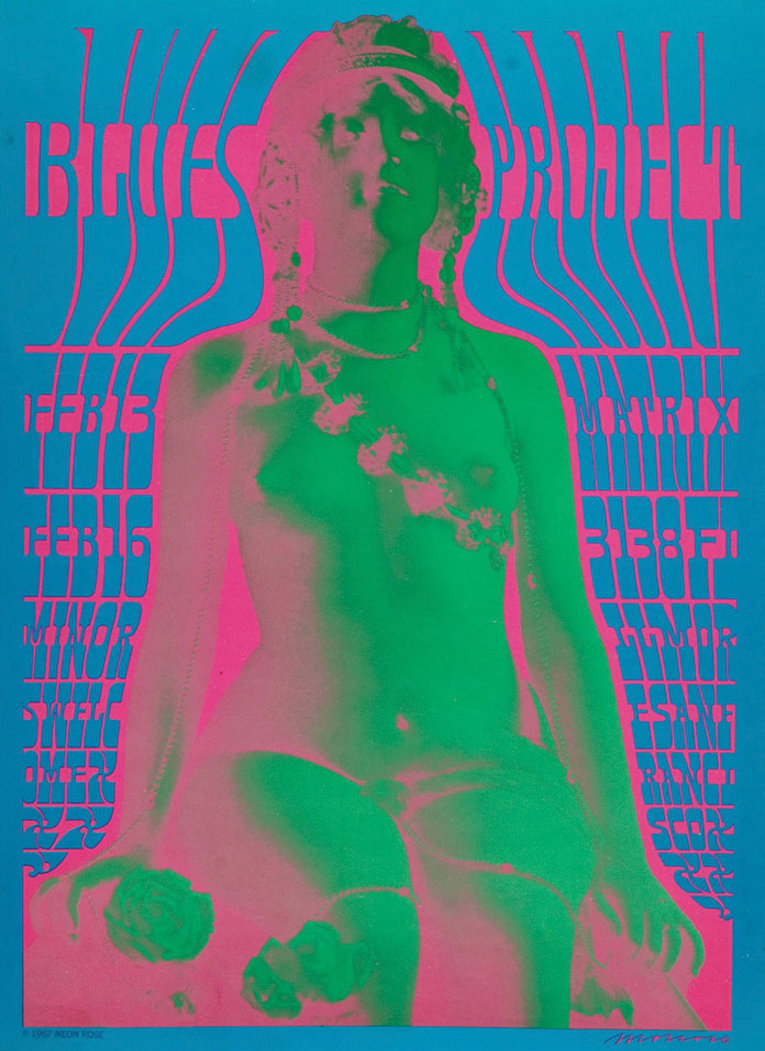
Chet Helms used Spanish-born, Cooper Union- and Yale-educated Victor Moscoso for occasional posters in 1966, until December when he became part of the regular Family Dog poster rotation. An instructor at the San Francisco Art Institute, the classically trained Moscoso was hesitant to jump on the poster art bandwagon. He finally realized, though, that he had to forget everything he had learned in art school about conventional graphic design. "I was trying to make the lettering legible," he recalled. "I was trying to get the message across quickly and simply. Because I was such a good student and learned the rules of good poster making, I was doing all the wrong things."

The psychedelic formula was to create posters that were nearly illegible, keeping the viewer as engaged (or confused) for as long as possible. Moscoso became adept at integrating electric colors and arranging them in ways that made his posters look as if the images were moving on the paper. He said, “The musicians were turning up their amplifiers to the point where they were blowing out your eardrums. I did the equivalent with the eyeballs.” Some of Moscoso’s most stunning pieces include the Blues Project poster from February 1967, the iconic Chambers Brothers “Sunglasses” poster that was used as the inspiration for the 2000 movie, Almost Famous, and October 1967’s “Flowerpot.”
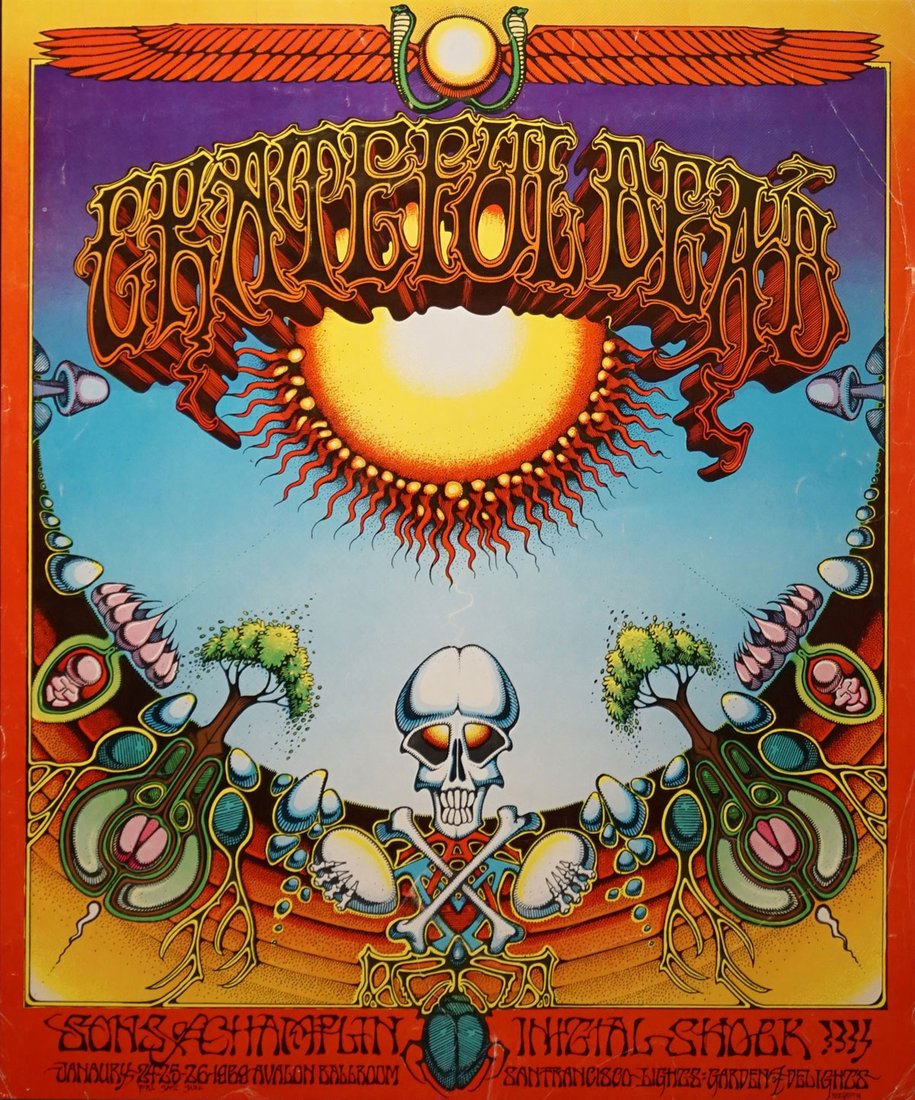
The last of the Big Five psychedelic poster artists was Rick Griffin, who produced his first concert poster in January 1967. Griffin was professionally trained in Southern California, and was a staff artist at Surfer Magazine before moving to San Francisco in 1966. Drawing on influences like Native American culture, the California surf scene, and the burgeoning hippie movement, he incorporated beetles, skulls, surfing eyeballs, torches, hearts, mushrooms, serpents, and flames into his art.
Griffin produced posters for both Helms and Graham, and was a noted perfectionist with a wildly ornamental and ornate, often visually challenging, lettering style. Some of his posters are among the most iconic of the period, including the February 1968 Jimi Hendrix “Flying Eyeball” and the January 1969 Grateful Dead “Aoxomoxoa.”
Instead of delivering clear messages, psychedelic posters advertising rock concerts often had to be deciphered by audiences. The main principle of psychedelic posters was not to deliver messages succinctly and efficiently, but rather to engage and entertain the viewers for as long as possible. The posters advertised the music, and in San Francisco of 1966-1968, creativity was the essence, borrowed from a vast spectrum of musical idioms, including R&B, East Indian raga, pop, blues, country, bluegrass, newfangled rock and roll, and jazz.
“...I think most great art is created in a furious moment.”

“The visual characteristics of psychedelic posters are manifold. Probably the most important factor is distortion, particularly as regards the information-bearing text of what is, after all, supposed to be an advertisement. Lettering was stretched and morphed, melted and compressed, inverted and more. This set the base level for the reception of the work, slowing comprehension, privileging the visual over the verbal, mandating a contemplative period followed by an Aha! moment of gestalt comprehension.” - Doug Harvey
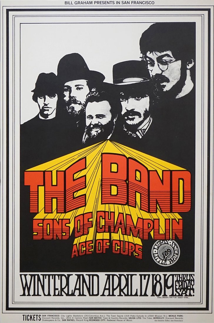
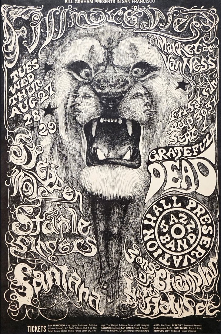
While the Big Five created and dominated the psychedelic rock poster style from 1966-1968, other artists were lugging in their portfolios to promoters and trying to become part of the scene. Several were notable, starting with Bonnie MacLean who replaced Wes Wilson in May 1967. Married to Bill Graham, she introduced a more nuanced psychedelic style with some of the most beautiful posters from the period. Lee Conklin, who designed 33 posters for Graham from 1968 to 1969, was the master of hidden pictures, with intricate drawings within drawings (or lettering) that delighted the likely-stoned viewer. His “Santana Lion” in August 1968 was a high point for Conklin and the movement.
Psychedelic posters began to wane after 1969, as Chet Helms had gone largely out of business and Bill Graham was migrating to artists who were more straightforward and could sell more tickets. Other promoters started using radio and newspapers to advertise concerts, as rock and roll had moved from what had been a cottage industry to Big Business. The era of psychedelic posters was largely over, but the impact of the Big Five and their artistic legacy continues to impact poster artists and aficionados to this day.
While the psychedelic poster movement was relatively short-lived, extending only from 1966 to 1972, more than 700 posters were created under the umbrella of either Bill Graham/Fillmore or Family Dog/Avalon. All of these and some additional independently-printed posters are listed in the seminal (and out of print) poster reference The Art Of Rock by Paul Grushkin.
The vast majority of the psychedelic posters were offset lithographs, meaning that the artist was typically present while the posters were printed and that there was a great deal of collaboration between the two. Unlike posters printed before the 1950s, psychedelic posters were typically smaller and often printed on thick paper stock or vellum, and rarely require linen backing.
By mid-1967, many posters were being printed in runs of 5,000, allowing for prices to be as low as $100 today. Earlier posters were printed in much lower quantities and are therefore more expensive. A lot also depends on condition, scarcity, and collectability, with some exceptional images commanding over $10,000. While not all posters were stapled to telephone poles – many were handed out to concert-goers to advertise next week’s show – how many survived the drafty attics and moldy basements in decent condition is an open question.
Images related to the article - click to see the full image and read captions