- Logo")
Vintage Posters of New Zealand, Graphic Wonderland
- 08/31/2021
- Peter Alsop

Peter Alsop–collector, enthusiast, and part-time author–introduces us to New Zealand’s proud and varied history of vintage posters.
As the youngest country in the world, New Zealand was forced to play catch-up in commercial art. Tourismwise, it didn’t muck around, establishing the world’s first government tourist department in 1901 to underpin a formalised tourism drive. It was no easy task. New Zealand was then 6.5 weeks from Europe by boat; a tough ask to expect Europeans to overlook the Grand Tour and sail riskily into the unknown. Although wellendowed with natural assets–now branded as “100% Pure”–the formation of a successful tourism industry is one of New Zealand’s greatest achievements on the world stage.
There are few surviving posters from these early times. The earliest known example, an 1888 poster by the Railways Department, integrates illustration into its graphic design. Typical of pictorial work of the era, the poster included voluminous text amongst detailed imagery, making it more suited to close study than a simple message seen from afar. While encouraging domestic travel on the growing rail network, an 1894 article also suggests a poster like this wove its magic abroad, displayed at “one hundred of the principal railway stations in England.”

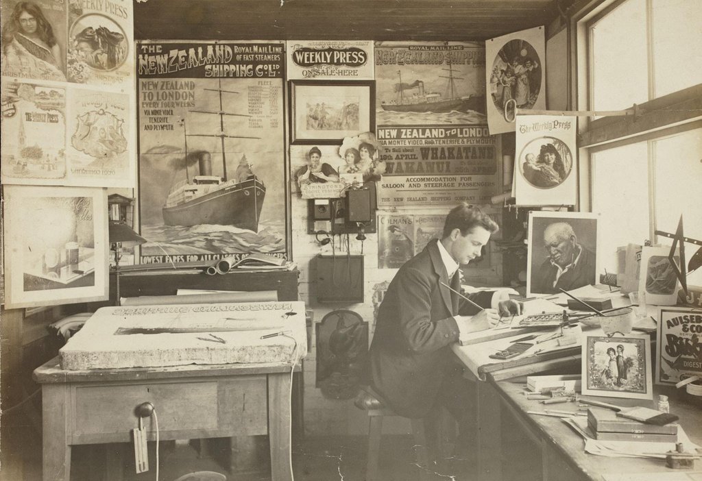
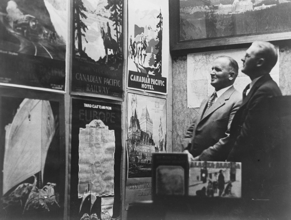
The article also noted a New Zealand Shipping Company poster attracting “widespread attention” and requests from “nearly a thousand schoolmasters for teaching about New Zealand”–a great example of the wide relevance of posters. That image is not presently known, though a photo a few years later gives an aesthetic hint. The photo of the design room of the Christchurch Press Company shows New Zealand Shipping Company posters and, more generally, offers a wonderful glimpse of turn-of-thecentury poster production, including a part-drawn lithographic plate. For some collectors, such behindthe-scenes material–including preparatory sketches and original artworks–are as special as the published posters themselves. For example, a small watercolour painting shows what a later New Zealand Shipping Company poster might have looked like, though the poster itself (if ever produced) is not known to exist.
Time travelling towards the Golden Age, a simpler design style emerged (as in other countries), with the Railways Department often leading the way. Established in 1920, an in-house design studio – Railways Studios – grew rapidly with a mandate to produce art for both government and (surprisingly) non-government clients. Headed by Stanley Davis (1891-1938), still a relative unknown in New Zealand art and design, the Studios had a prodigious output and, literally, decorated the New Zealand scene. Davis himself produced many notable posters, some attracting international praise. In a 1926 article, he cursed the conservative artistic taste of clients; a sign he wanted to stretch boundaries and introduce new styles. In 1938, Davis died unexpectedly at age 46, robbing him (and poster lovers) of a promising artistic career.
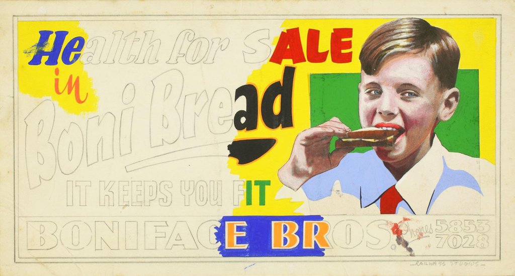
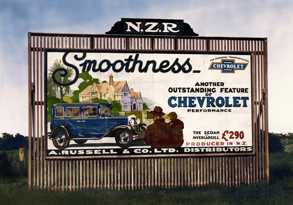
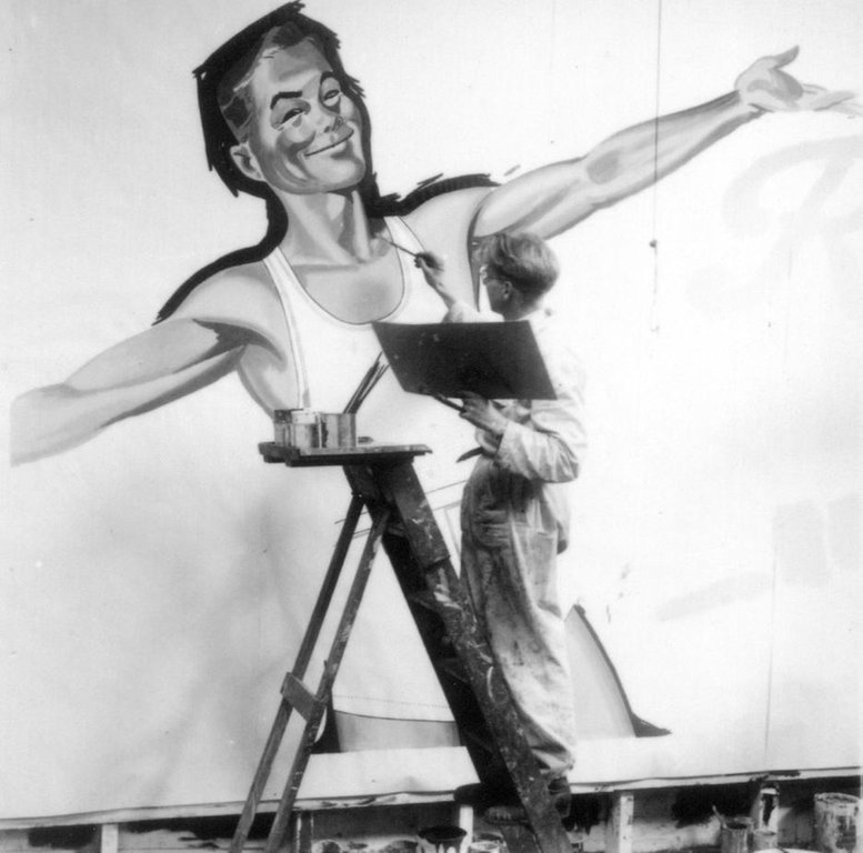
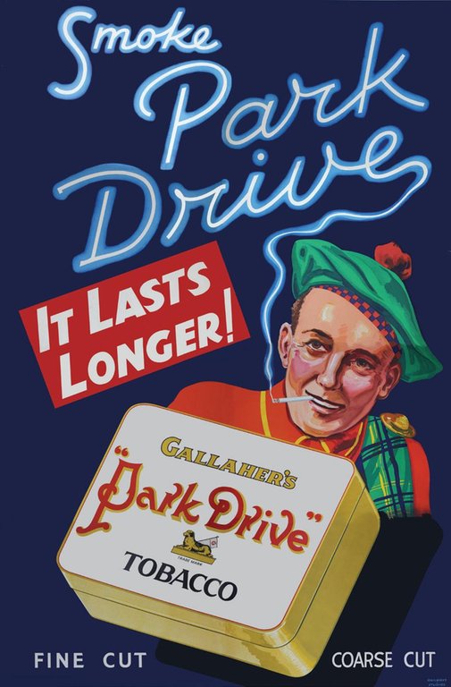
As well as designing single-sheet posters for station platforms, the Studios created large hand-painted billboards (which they called posters), often comprising 24 sheets of overlapping paper that made huge 10x20ft images. Loved by many – “the gallery of the street” – the billboards were loathed by others for scarring the landscape; a debate that raged for years. There are no hand-painted posters/billboards known to exist, though there are significant collections of original artworks (about 10”x15” in size), often only part-painted to colourcode the work without wasting time on the whole design. Multi-sheet lithographed posters were also produced, with important examples of 2-sheet and 4-sheet posters held in public and private collections. An 8-sheet poster (120”x80”) also survives, a tobacco advertisement with smoke skilfully forming the main typography.
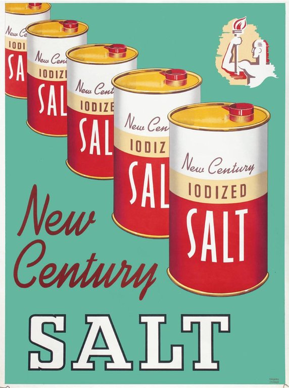
The Studios continued to grow, dominating outdoor advertising in New Zealand until the mid-1980s; a staggering run for a government agency. Many surviving posters stem from the mid-century period; a time when abstraction was better-honed and the integration of text and imagery – a necessity for great design – was often more adept. New Century Salt is reminiscent of Andy Warhol’s use of Campbell’s soup tins (commencing in 1962), yet was created around 14 years earlier in 1948-49. Such examples underscore the ongoing influence of commercial art on the evolution of fine art (in this case on Pop Art), and the benign attention paid to foundational material like posters and advertisements relative to the art they helped inspire (think cartoons and Roy Lichtenstein as an example).
There are few surviving posters from these early times.

New Zealand’s tourism posters were also benefiting from artistic developments and the wider poster craze. Well-known both then and now is Leonard Cornwall Mitchell (1901-1971), who produced some of New Zealand’s most arresting travel poster designs.
Chief amongst his creations was Blue Baths (1936), an overtly Art Deco design profiling a new public swimming pool, permitting mixed-gender bathing in the curative mineral water of Rotorua’s geothermal area. Mitchell’s poster is distinguished by his masterful use of primary colours and simplified forms. Using the Renaissance technique of repoussoir, the poster is framed with the venue’s Romanesque columns, skilfully leading the viewer’s eye into the poster for full immersive effect.
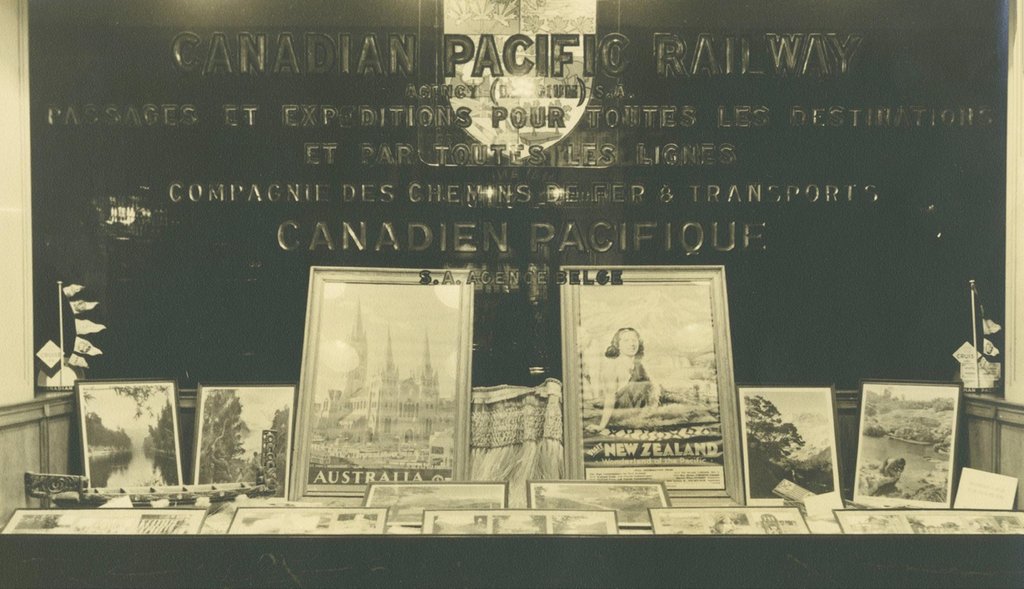
An under-tapped area of travel poster research–globally–is to what extent posters, even when domestically revered, impressed abroad. How well did they work? Did media single out designs? Were particular posters coveted by museums? Like many countries, New Zealand had reciprocal display agreements with other countries, incentivising better work as artists observed work of international peers (essentially an international design competition). A recently discovered photo shows posters from Australia and New Zealand prominently displayed in the window of a Canadian travel bureau. In another example of the poster craze, New Zealand also hosted international travel poster exhibitions, often touring to multiple cities.
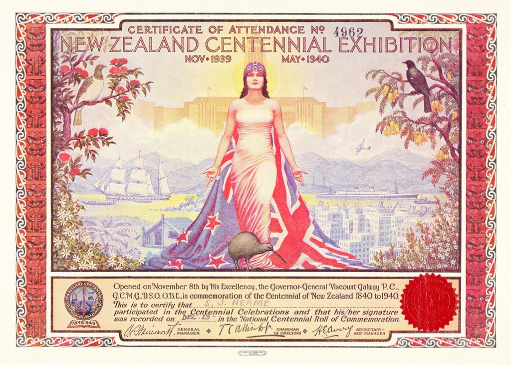
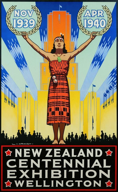
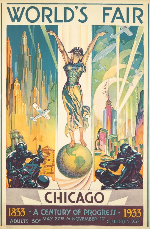
Building on his travel poster success, Mitchell was also asked to create the official poster for New Zealand’s Centennial Exhibition (1840-1940). While the breaking war hurt attendance, many visitors were drawn by Mitchell’s image of a young Maori woman, with upraised arms, holding laurels encircling the event’s dates. Imagery of Maori had long been used for tourism promotion, including by Mitchell, but here a young indigenous woman shouldered a much bigger responsibility, representing a young country which had come of age. That a female Maori figure took centre stage, at a celebration of colonialism and European settlement, was even more remarkable. It can now be seen as both a marker and harbinger of women’s rights, such as New Zealand being the first country to allow women to vote (1893), through to today’s international profile of Rt. Hon Jacinda Ardern, New Zealand’s current Prime Minister. Interestingly for United States poster aficionados, Mitchell’s poster was likely inspired by Glen Sheffer’s I Will from the 1933-34 Chicago World’s Fair. Both women–I Will and Zealandia–were well-known allegorical female figures at the time, with Mitchell also creating a European Zealandia for the exhibition’s certificate.
As any collector knows, posters are visual and social artefacts with many tales to tell.

For reasons not fully known, Mitchell largely disappeared from the poster scene after 1940, though continued a long and prodigious commercial art career. In his footprints came Marcus King (1891-1983), now the best-known painter and designer of
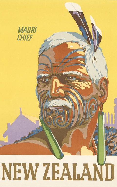
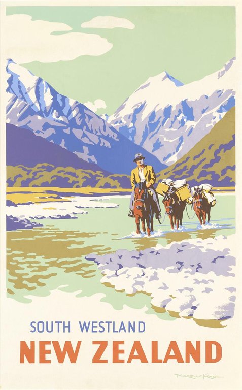
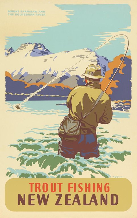
New Zealand tourism art. King is best known for his striking travel posters, but was also a successful impressionist painter and muralist, including the creator of important history paintings. Internationally, there are probably few artists, anywhere, who have mastered Impressionism, large-scale documentary murals and the sharp edge of graphic design through posters. Among his best posters are a flying skier – suspended dramatically in mid-flight – a Maori chief, a fisherman (cleverly placing the viewer into the scene) and numerous scenes of an idyllic pastoral paradise. The images place King as New Zealand’s premier poster artist of the mid-century period. His 26-year stint at the Tourist Department (1935-1961), and retirement at age 70, reveal more than a hint of the passion he held for his work. Even after a prodigious output, King noted in retirement: “I have wasted so much valuable time, which I could have spent painting.”
Like other countries, New Zealand’s vintage poster record is constantly evolving. There has been growing and perhaps overdue interest recently in posters and design, along with the achievements of artists like Davis, Mitchell and King, and the studios within which they worked. Naturally, this has included a re-assessment of New Zealand’s vintage posters in the context of art and social history. As any collector knows, posters are visual and social artefacts with many tales to tell. And, in some ways, the New Zealand vintage poster story has only just begun.
Peter Alsop’s short documentary, Graphic Wonderland, on New Zealand posters and commercial art, can be viewed on Vimeo (http://vimeo.com/114574856)
Images related to the article - click to see the full image and read captions