- Logo")
Focus on Style - Art Nouveau

Known by various names throughout Europe, Art Nouveau was a short-lived but hugely influential design style that emerged in the late 1880s.
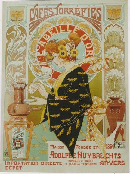
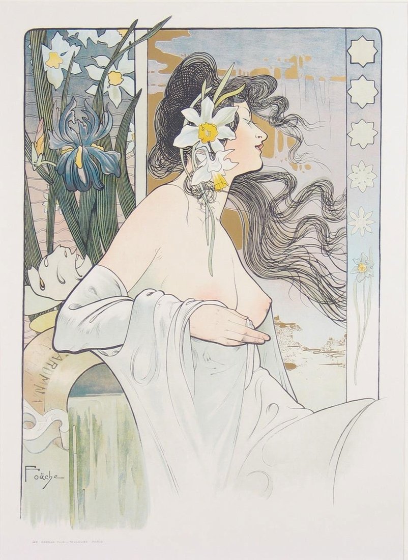
It was a direct reaction to the cult of mechanization brought about by the Industrial Revolution, as well as a rejection of the pervasive rules of the academic art world. Turning to nature, Art Nouveau embraced organic forms, sinuous lines, and a sense of sensuous movement. It also attempted to blur the barriers between high and low art, elevating aspects of design typically seen as beneath the supremacy of painting and sculpture. In fact, the most interesting examples of Art Nouveau appear in jewelry, ceramics, interior design, architecture, and, of course, posters – all common items traditionally thought of as functional rather than aesthetic. Art Nouveau merged that utilitarianism with fine design, bringing beauty to the everyday.

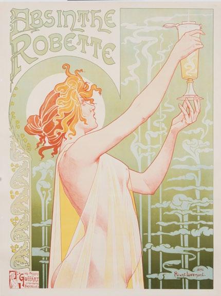
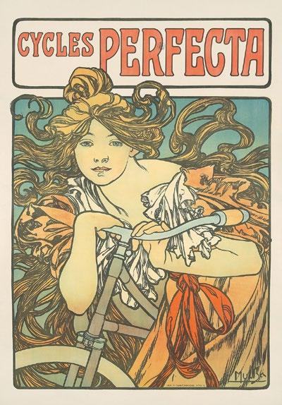
As mentioned previously, Art Nouveau went by many names, and each country had its own particular take on the style. In Germany, Jugendstil artists like Thomas Theodor Heine and Julius Klinger brought eerie sexuality and humor to the medium, while in Austria, Secessionists like Koloman Moser harkened back to Byzantine forms. In the United Kingdom, Charles Rennie Mackintosh became the leader of the Glasgow School, combining the restraint of Japanese minimalism with whiplash curls, while in America William H. Bradley brought an unprecedented level of detail and patterning to the country’s advertising scene. The greatest poster artist of the period, however, was Alphonse Mucha, a Czech national living in Paris, who single-handedly brought Art Nouveau to the streets.
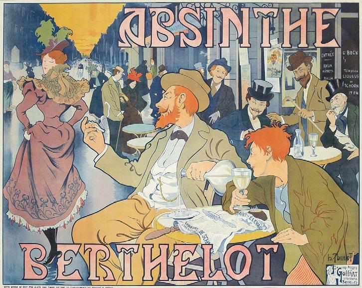
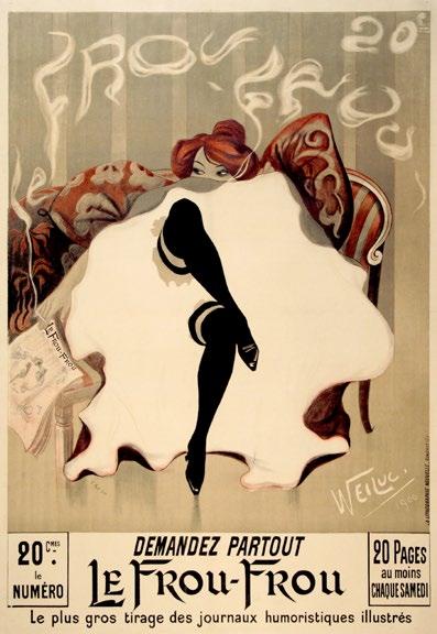
Looking at other posters from the period in France, most are still stuck in the tropes of the Belle Époque, having developed out of caricature and illustration in the 1870s. They generally rely on broad, gestural strokes, simple outlines, and bright, primary colors. Jules Chéret is perhaps the best example of this holdover, continuing to work through the Art Nouveau period without really altering his signature touch. Théophile-Alexandre Steinlen and even the infamous Henri de ToulouseLautrec also failed to fully embrace this new aesthetic movement, making Mucha and his ilk more the exception than the rule. This is perhaps why Art Nouveau posters were so captivating at the time – they stood apart from what other posterists were doing. Intricate, pastel gems quietly glistening against the loud, often garish, posters papering the city.
“Whether tongue-incheek or viciously biting, the poster serves as a commentary on the perceived pretention of Art Nouveau. ”

Rarely discussed, though, is the elitism engrained within Art Nouveau posters. As with many artistic movements, its primary audience as a genre at large was the uppermiddle class. All the gorgeous décor and fashions were not meant for the average person, nor would anyone outside of certain economic strata have necessarily seen examples of Art Nouveau in the regular world. It was aimed at a particularly intellectual, artistic, wealthy clientele. Meanwhile, the style of the Belle Époque poster was visually synonymous with bohemian street culture. These posters promoted cabarets and newspapers -- popular, accessible pastimes. While Mucha certainly designed images for simple commodities like Job rolling papers or Lefèvre-Utile biscuits, the style of the design is shockingly unfamiliar to its intended audience. It is like coming across a Gutenberg Bible in a comic book shop – what do you even do with it? This is perhaps why Steinlen so geniusly pokes fun at one of Mucha’s signature flairs in his iconic Chat Noir poster. In it, the black cat sports an elaborate halo, something ever-present in many Mucha posters. But instead of crowning a gorgeous, ethereal woman representing the noblest parts of nature, this halo crowns a mangy feline promoting a seedy nightclub in Montmartre. Whether tongue-in-cheek or viciously biting, the poster serves as a commentary on the perceived pretention of Art Nouveau.
All of this would change, however, in 1900 when the Exposition Universelle in Paris presented Art Nouveau to almost 50 million people, instantly making the genre familiar, exciting, and downright trendy. Every major artist and designer within the movement created something spectacular to showcase, including Mucha who designed the pavilion representing Bosnia-Herzegovina. Even the posters promoting individual parts of the event reveled in Art Nouveau glory, most especially Privat Livemont’s design for the Palais de la Femme and Manuel Orazi’s image for the Théâtre de Loie Fuller. The popularity and accessibility of Art Nouveau had reached its peak.
By 1910, however, the main poster designers within the field would move on to other things. Mucha relocated back to Prague where his style took on more elements of Czech folk art, while other leading Art Nouveau posterists like Livemont, Eugene Grasset, and Paul Berthon either stopped producing work or attempted to evolve their style toward the growing trend of what would become Art Deco. By the dawn of World War I, Art Nouveau was passé, a symbol of a decadent, more naïve and optimistic time. Its contributions to graphic design, however, have influenced generations of artists, most interestingly those from the San Francisco psychedelic scene who coopted those signature organic forms and languid ladies sixty years later to promote concerts and clothing for the Flower Power era. It remains one of the most powerful, rare, and sought-after styles of poster design today.
“By the dawn of World War I, Art Nouveau was passé, a symbol of a decadent, more naïve and optimistic time.”
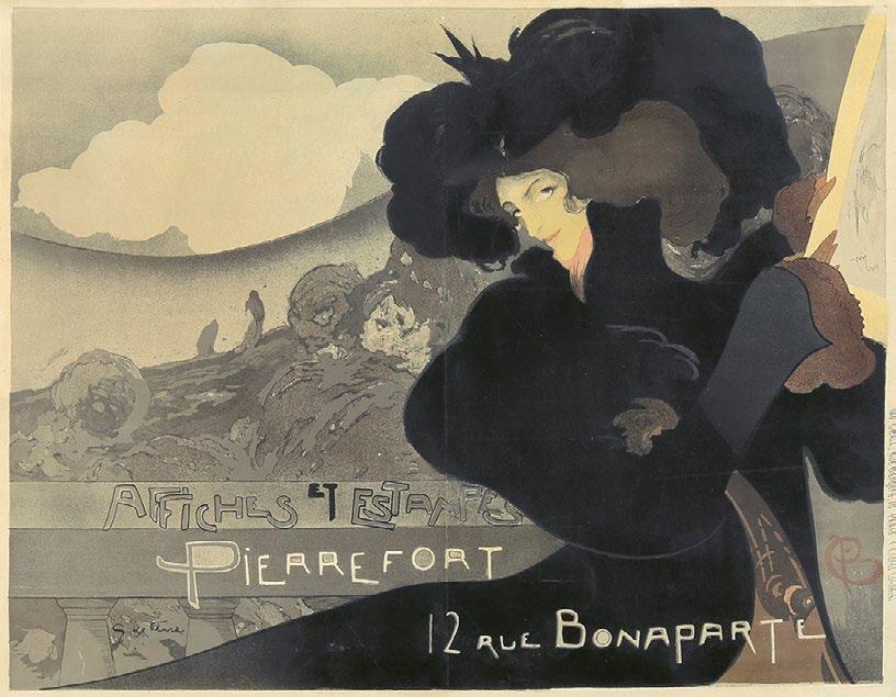
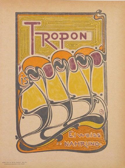
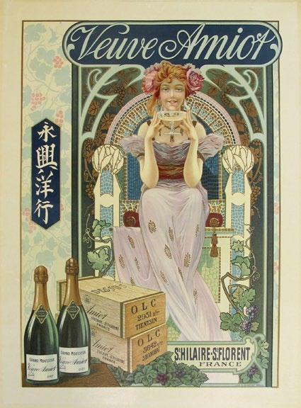
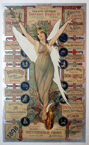
Images related to the article - click to see the full image and read captions