- Logo")
Focus on Designer - The Life and Art of Julius Klinger

The tradition and development of graphic and poster design in Austria and Germany has a distinct timeline and trajectory. Influenced by radical socio-cultural changes and extreme political-economic considerations, the artists whose lives straddled the 19th and 20th centuries were both the product of and the catalyst for some of the most significant design evolutions in modern graphic history.
Among poster collectors and aficionados, there is instant name recognition for designers like Lucian Bernhard and Ludwig Hohlwein; however, because all primary source material that relate to him are only available in German, Julius Klinger has languished in relative obscurity. Although recognized as a trendsetting, forward-thinking innovator during his lifetime, Klinger is virtually unknown to contemporary students of graphic design outside of Germany.

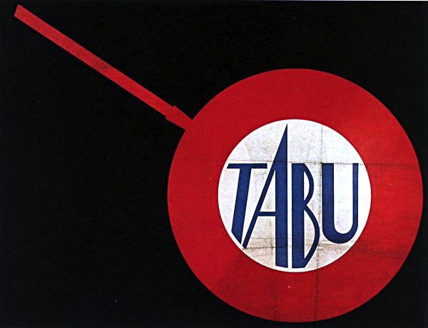
Considering that Klinger was one of the first to define the concept now recognized as “branding,” and that one of his earliest projects can be said to have laid the groundwork for the ultra-modern concept of iconographics, one might assume his significance would merit more than the occasional footnote in design anthologies. Klinger looked at poster design as a responsibility—an obligation—that an artist needed to assume with the greatest possible skill, humility, and determination.
Significant social, demographic, and cultural changes were taking place across Europe in the late 1890s and early 1900s. Posters became an important and universal means of appealing to a changing, often multi-lingual urban population. Artists and marketers had no end of subject matter that they could use to appeal to an ever-growing audience ranging from high society to a swiftly expanding working-class. In such an environment, commercial posters needed to, in the space of a few seconds, attract the attention of passersby and imprint upon them the purpose of the marketed product.
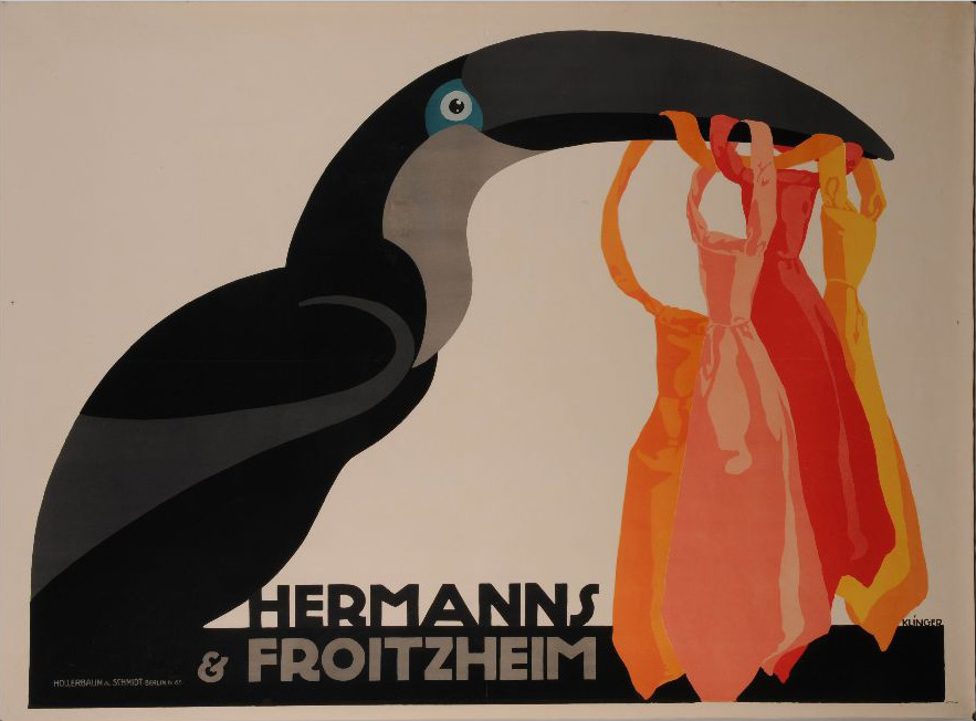
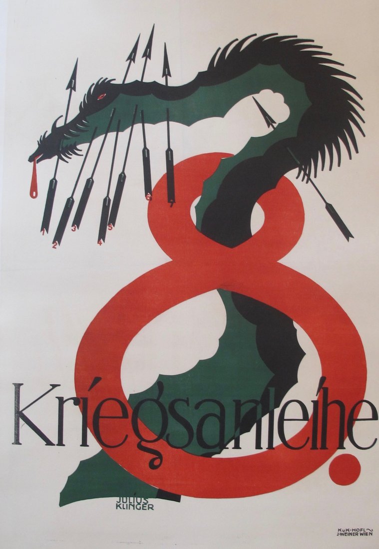
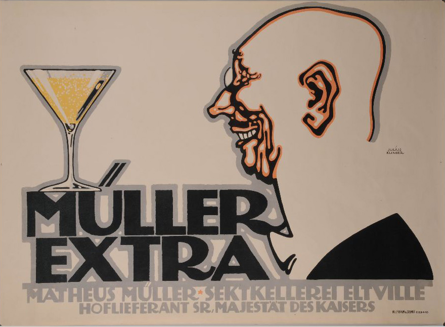
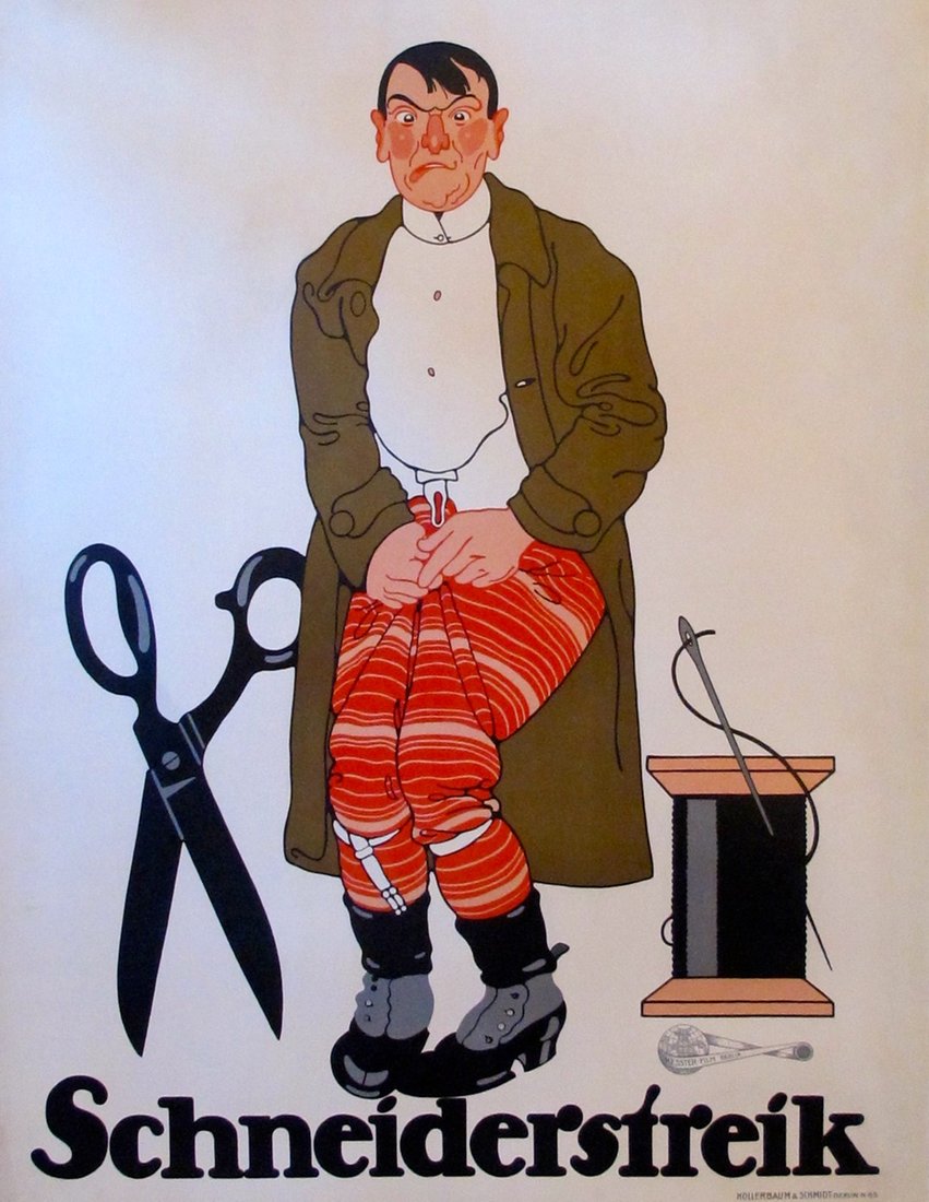
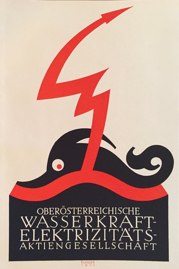
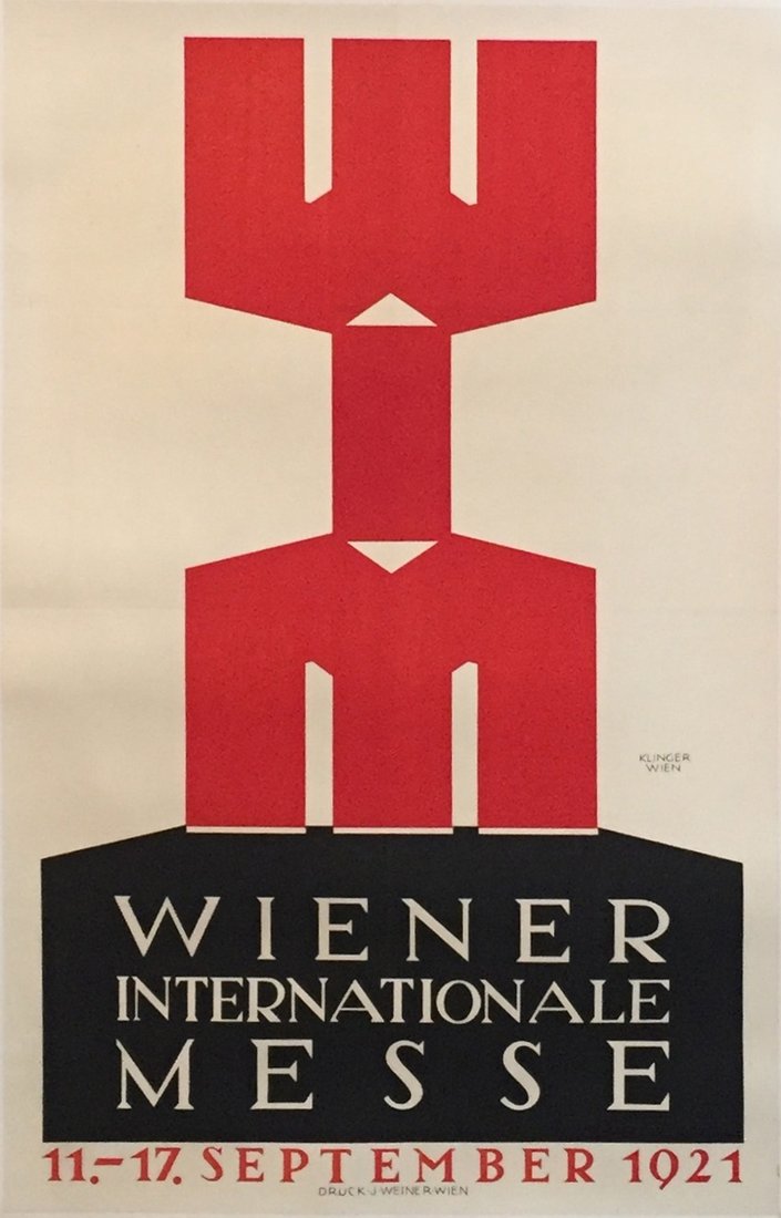
It was during this time that Klinger’s commercial mandates solidified—clear, concise, and cogent “product posters” (Sachplakat) that emphasize both the product being sold as well as the skill of the artist. Klinger’s work, like that of his countrymen and fellow poster designers Lucian Bernhard and Ludwig Hohlwein, was clean and crisp; but, unlike either Bernhard or Hohlwein, Klinger’s output used irony in ways that were both cutting-edge and cutting.
Every citation related to Julius Klinger in design or graphic art publications mentions his quirkiness: an absurd, almost ludicrous, singular ability to integrate visual puns and jokes into product and commercial posters. Where other posters were graphic odes to the commercial object being merchandised, Klinger’s works were that and more.
He had the ability to fascinate both the man on the street as well as the aficionado in the same way.

Anita Kühnel, a respected German curator and author of a book on the artist, has written that his humor was “kind and ironic, without sentimentality … accurate without being coarse. He had the ability to fascinate both the man on the street as well as the aficionado in the same way.”
For Klinger, advertising posters were the support mechanism for selling products—no more and no less. He recognized that posters could be an independent art form used by the modern market economy. As such, an advertising poster was not a matter of art, but “according to its own nature, a property of the market.” By combining the skills and techniques used by traditional artists in the service of business, Klinger was actively elevating posters and commercial artists to a respectable place alongside the more revered people who practiced “fine art”(painters and sculptors). In 1910, Klinger wrote that “there should be no relation between a painting and a poster: they have very different functions and have to remain distinguishable. If a poster looks like a painting, it’s a bad poster. But I think it is even worse when a painting looks like a poster. I do not recommend mixing these different art genres to anyone involved.”
His reputation as a trendsetting initiator was encapsulated in a review penned by a contemporary social critic named Walter Schuber. Schuber noted that beneath the comic irony of Klinger’s posters there were other factors that made his works “effective, and that distinguish him in the new field of German poster art. His work seems unmistakably fresh and powerful. One is tempted to speak of timelessness, untouchability, and unaffectedness, which remind one of ‘eternal values’ in relation to something so dependent on fashion. No other artist has been able to achieve this kind of balance, which is based on the concept as a whole, with each element carefully balanced and tested against the other in every conceivable way. It looks at once quick and effortlessly put together.”
While his name is perhaps not as well known as it should be, generations of graphic designers, marketers, and poster artists have built their careers—and their work—on the elemental and theoretical foundations Klinger set down almost a century ago. As historian Ruth Heftig wrote recently, “the glamour of martyrdom came to halo (certain) artists with political virtues that few of them sought.” I would argue that Klinger would not have sought martyrdom, but rather recognition for a body of work that is timeless, irreverent, and powerful. Currently, his posters take pride of place in museum collections around the world, collectors pay increasingly large sums in order to acquire the few pieces that remain in circulation, and his name is once again known and celebrated.
I think he would like that.
Excerpted from The Life and Art of Julius Klinger: Beyond Poster Art in Vienna. Karen Etingin, L’Affichiste Press, 2016 (Montreal) ISBN 9 780995 078505
No other artist has been able to achieve this kind of balance.
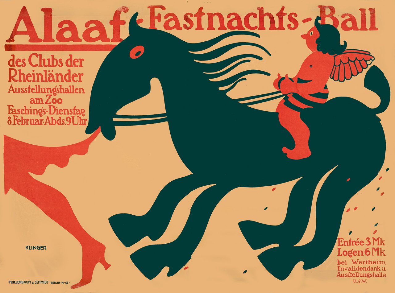
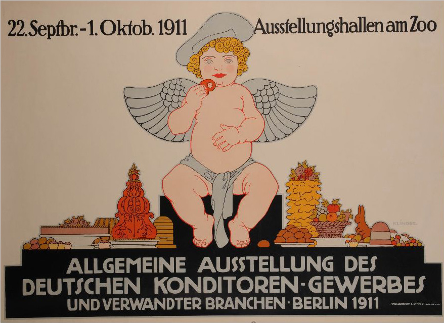
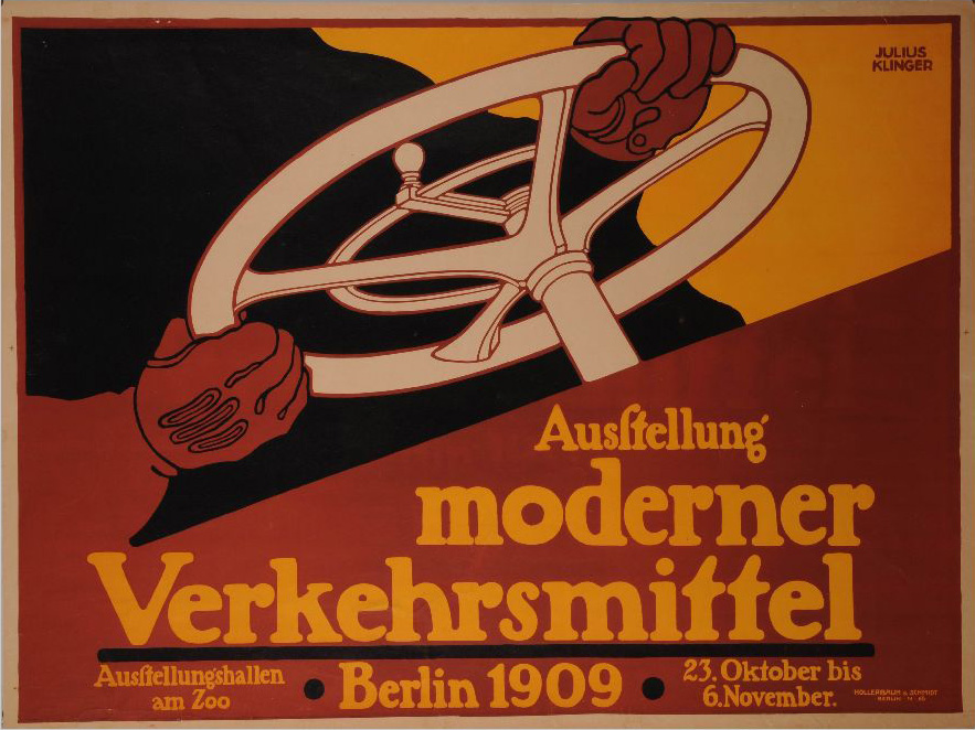
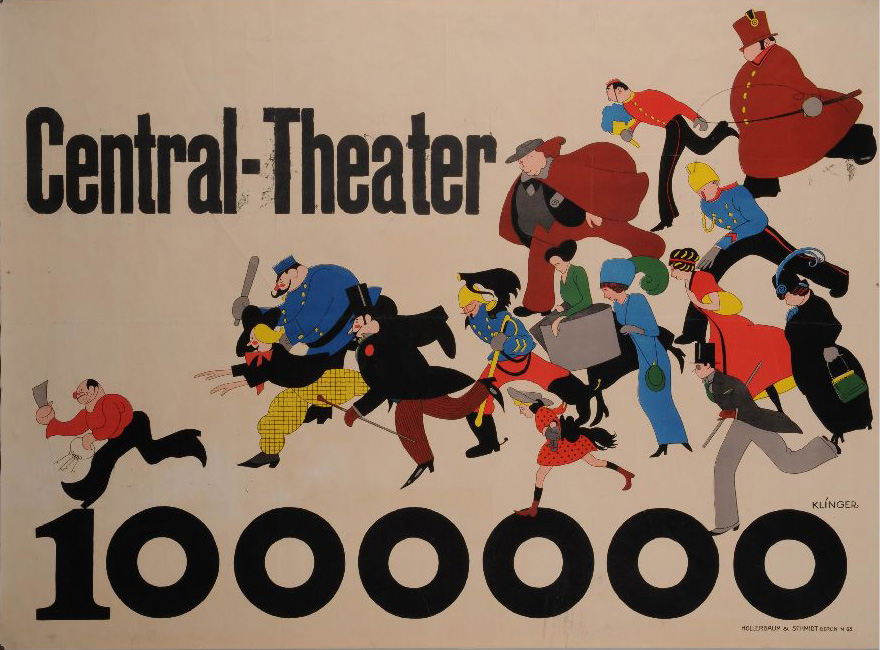
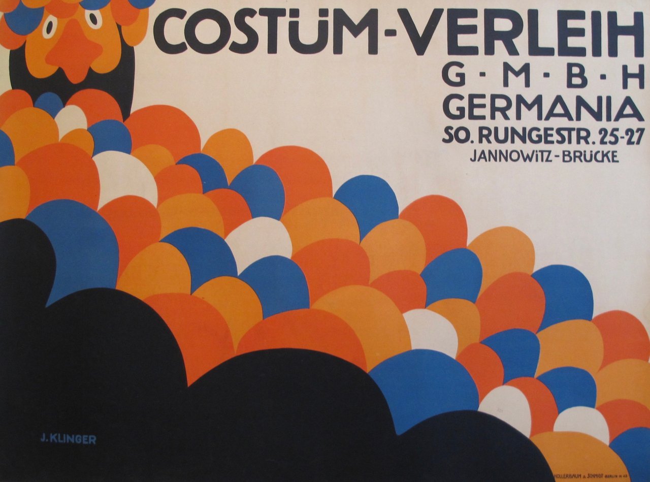
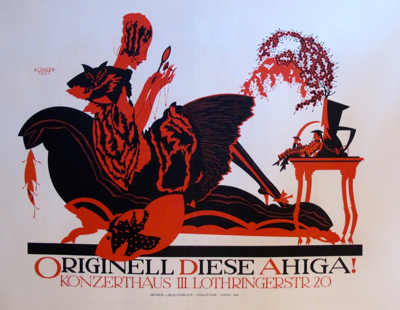
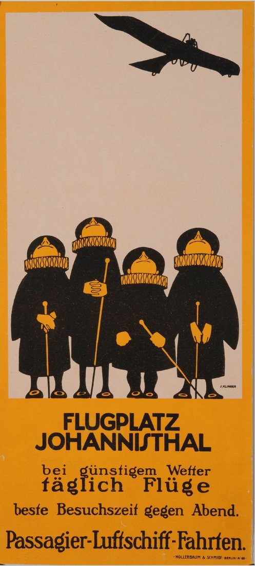
Images related to the article - click to see the full image and read captions