- Logo")
Focus on Style - Safety Posters & Public Information In Mid-20th Century Britain: RoSPA’s Industrial Safety Posters During WWII
- 09/22/2022
- Paul Rennie - Rennies Seaside Modern

Introduction: Posters & Emergency
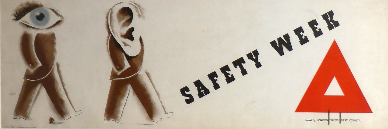
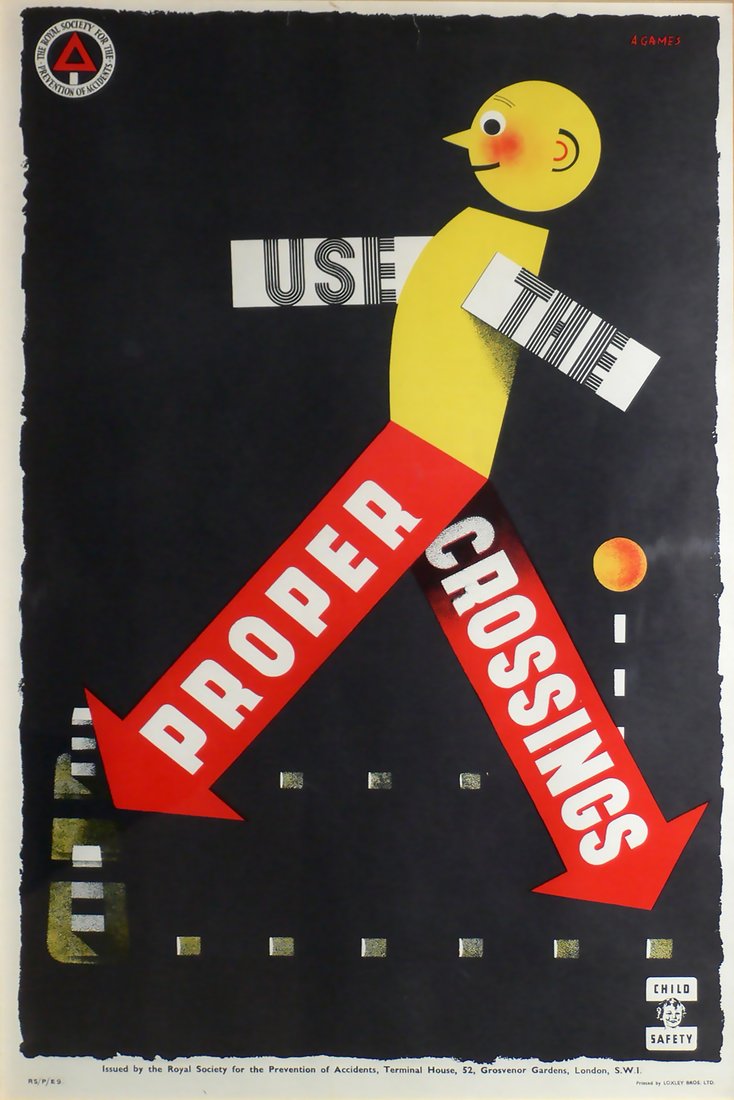
Established in 1916, the Royal Society for the Prevention of Accidents (RoSPA) initially used posters in a limited capacity, focusing on safety week campaigns that informed drivers and pedestrians of the dangers related to the great increase in motor traffic between the wars. Given its origins and preoccupation on the dangers of industrialisation, it was entirely appropriate that RoSPA should be aware of the potential of posters—a medium designed to be seen by virtue of scale and color, from a distance and while moving. The ambition of the society throughout the 1930s may be gauged by its use of the foremost poster designers Edward McKnight Kauffer, Hans Schleger (Zero), Abram Games, and Tom Eckersley, working with Eric Lombers. As these items were meant to be used and are by their nature ephemeral, very few survive.
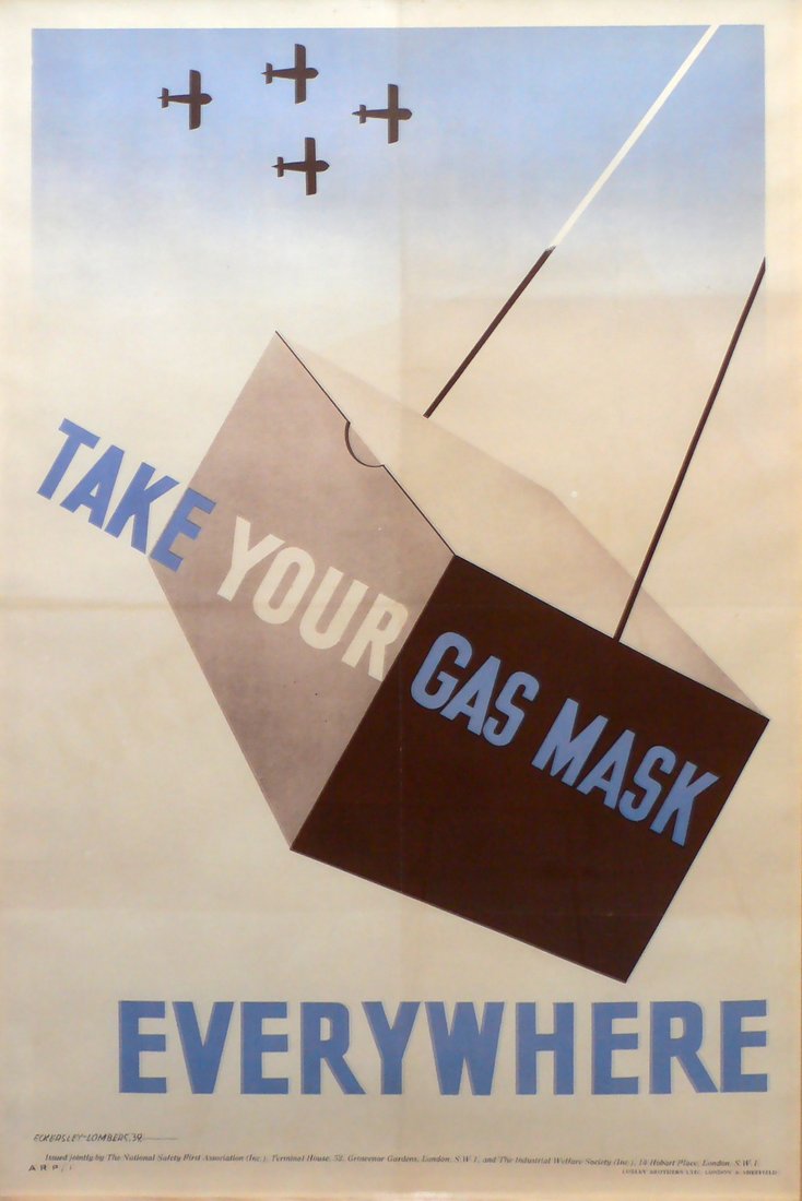
During World War II, RoSPA produced a variety of posters on various themes associated with industrial and logistical safety so as to support the urgent efforts of war production on Britain’s Home Front. These posters attested to the need for the consideration of safety as part of national survival, production, and economic efficiency. The circumstances of war and national emergency provided an expanded platform for a nationwide campaign and a more continuous program of engagement. Accordingly, the range of artists commissioned to produce these posters grew to include many significant designers, both domestic and foreign.
In addition to the themes and personalities associated with the campaigns, the constraints of printing posters within the strained war economy helped shift the practice away from commercial art and more towards graphic design. This resulted in posters distinguished by their evident use of mechanical reproduction and typo-photo elements, usually associated with the continental masters of modernist graphic design and the graphic experimentation of the preceding decade. Each of these considerations combined make these safety posters an interesting and engaging field of collection and study.

Communicating In Crisis
Communication of public information requires clarity, simplicity, and continuous repetition. From the contemporary reality of conflicting, neverending news sources, it is easy to forget that World War II played out against a simpler backdrop, with limited print media, cinema, and radio as the means of mass communication. The circumstances of WWII—at least in Britain—provided a publishing boom associated with public information: posters, books, and ephemera were printed in large quantities to support the war effort and to feed a widespread public appetite for information beyond the usual considerations of military and political propaganda.
RoSPA: Organization Beginnings & WWII Influence
Initially founded in 1916, the London Safety First Council helped people cope with the dangers of increased road traffic. In 1923, it expanded through the National Safety First Association (NSFA), composed of regional councils dedicated to safety. The NSFA coordinated activities around the country, presenting awareness and safety week campaigns complete with displays, talks, and local newspaper coverage.
The start of World War Ii cause this association evolve into a coordinated national organization, expanding its scope of responsibilities across both road safety and industrial workplace safety. In 1941, the NSFA was favored with Royal patronage, and thus renamed the Royal Society for the Prevention of Accidents (RoSPA), supervised by the Ministry of Labour under the direction of Ernest Bevin. Bevin emerged from his work with RoSPA as an unexpected champion of design as an expression of social progress. In the 1930s, he came into contact with Frank Pick of London Transport. Pick is acknowledged as one of the greatest British patrons of modern design, instrumental in coordinating its various branches—architecture, engineering, mapping, typography, and posters—into a single, coherent expression of values (known today as “corporate identity”). Their friendship was characterized by a shared background in nonconformism and a belief in social progress through the modern, rational application of resources.
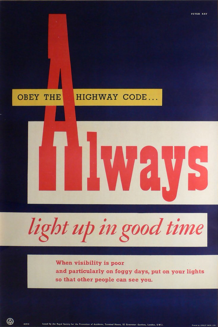
Under the guidance of Ernest Bevin, RoSPA’s efforts were redirected toward industrial safety and to the provision of national service. The campaign was built around the concept of designated safety officers in factories, the establishment of first aid regulations, and the distribution of posters and information for display and discussion within the workplace. At the height of its efforts, RoSPA was annually distributing some half-million posters to its member subscribers through a monthly package of materials. Posters were often printed double-sided in order to economize whilst providing a variety of messages. Effective posters were reprinted at intervals.
“In style as well as production, the RoSPA posters represented a decisive break with pre-war poster traditions.”

Printing: Mechanical Reproduction, Typo-Photo, Offset Printing, Split-Duct
The accelerated propaganda requirements attached to the Home Front in Britain during WWII required a rapid transition away from craft traditions in lithographic printing toward forms of mechanical reproduction. The print industry in Britain had remained relatively conservative, entrenched in its factory organizations and machinery. Stone lithography remained the standard, at least in poster design, until the end of the 1930s. These outdated methods were replaced with advent of WWII and the associated demands for increased quantity and production.
Posters produced by the Ministry of Information come from a range of smaller scale printing firms that are quite distinct from the names usually associated with the printing of artistic posters during the 1930s—the RoSPA posters, for example, were printed by the Loxley Brothers in Sheffield. The increasingly technological specification of designs associated with mechanical reproduction required speed and accuracy. The image for each poster was painted onto thick glass that was then exposed to sensitized, metal lithographic plates that could then print quantities of each composition.
Design
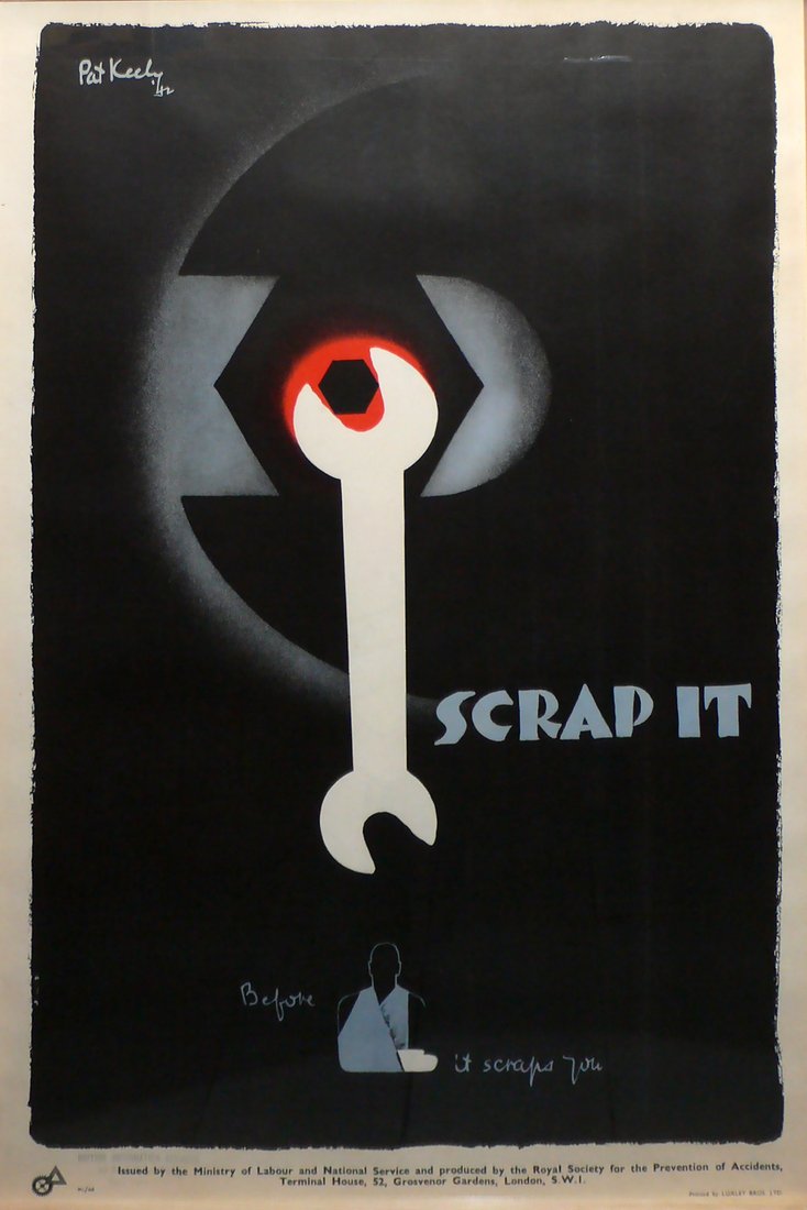
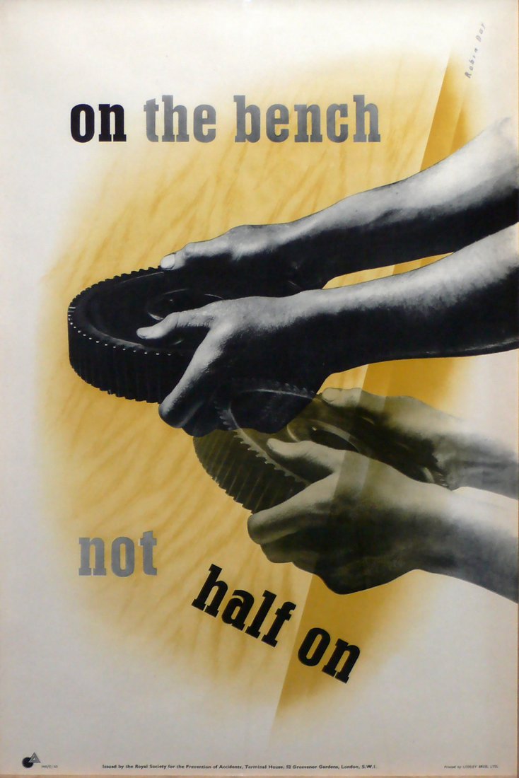
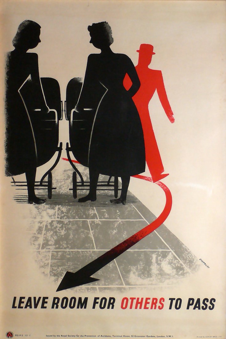
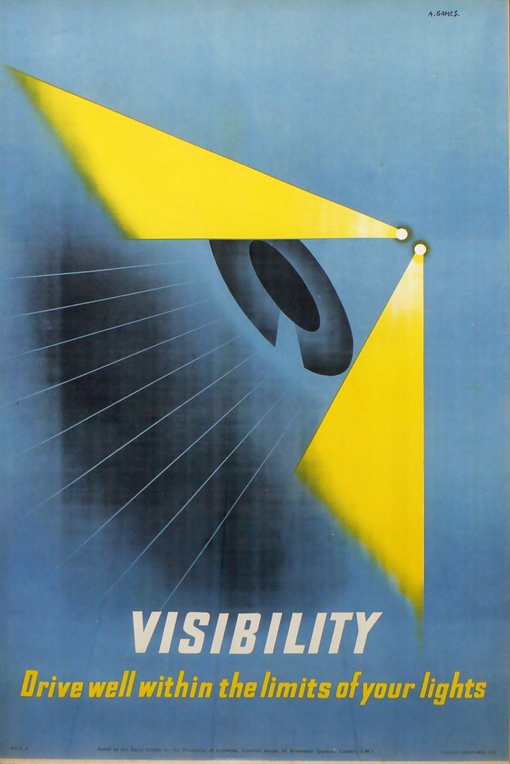
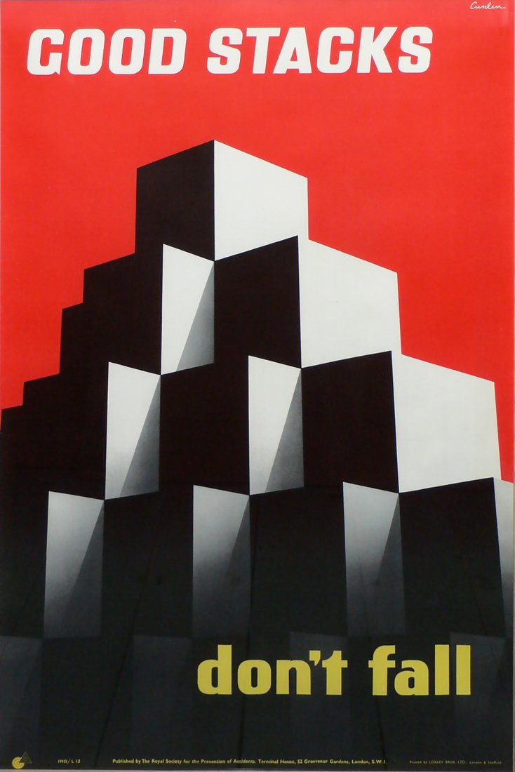
In style as well as production, the RoSPA posters represented a decisive break with pre-war poster traditions. The shift to mechanical reproduction facilitated the ability to incorporate photography. When thoughtfully combined with typography, such compositions referenced the visual language of modern art. The RoSPA posters seem to conform most closely to the established forms of graphic modernism seen in pre-1933 Germany and Russia in the 1920s. The similarities are evident in the dynamic geometry of composition, the closer integration of photographic image and typography, and the radically simplified color palettes.
One of the most refreshing aspects of these posters is the eclecticism of the typographic choices made by the designers. The sans-serif letterforms particularly lend themselves to modernist desires for speed and economy. In Britain, sans-serif typography had already become established through developments by Edward Johnston for the London Underground and by Eric Gill for the Monotype Corporation (Gill Sans). It had also been used by the London and North Eastern Railway for its public facing communications.
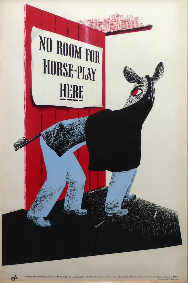
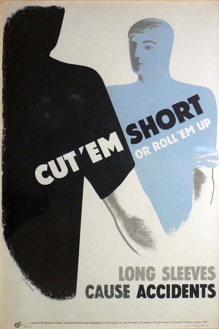
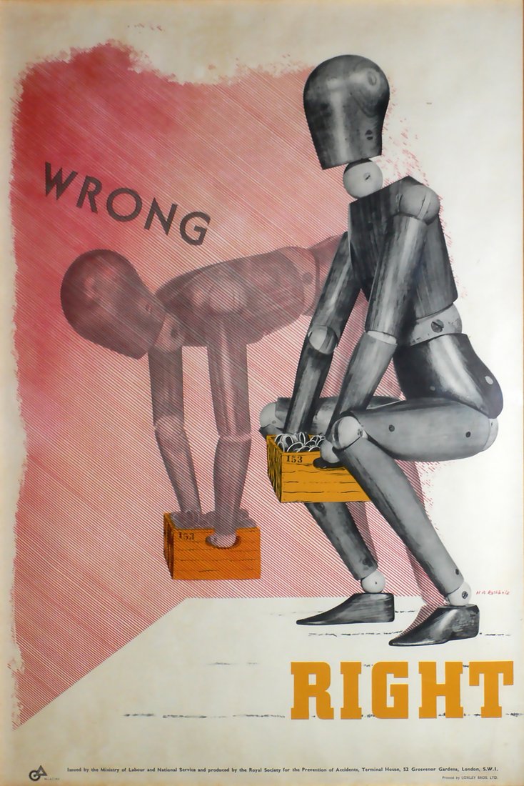
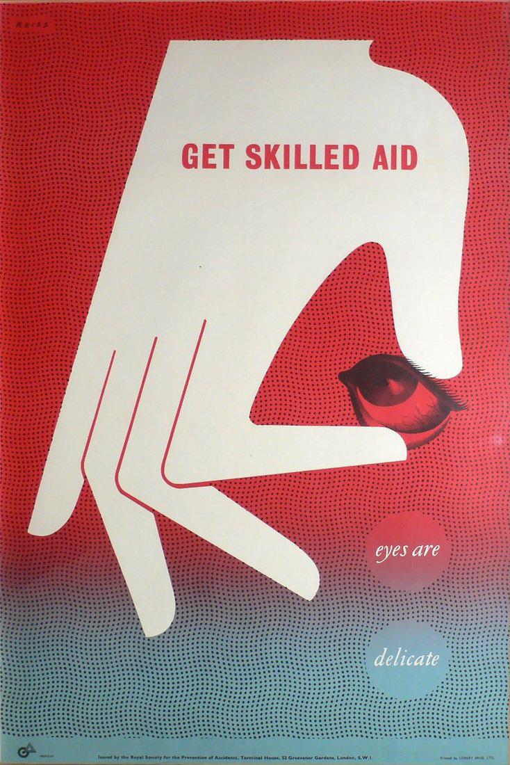
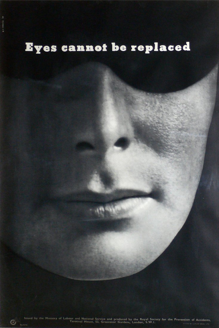
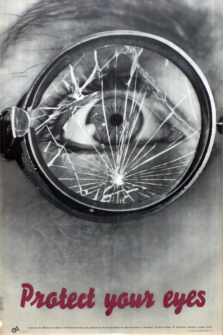
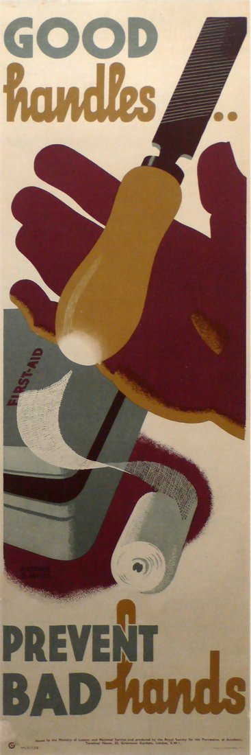
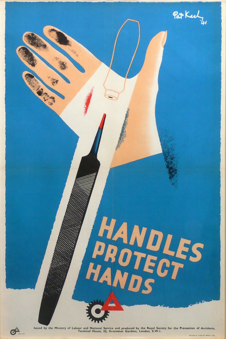
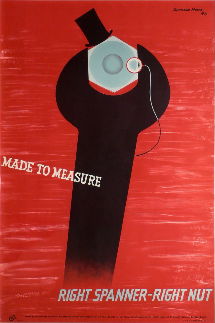
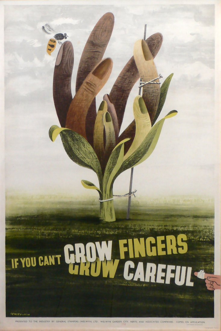
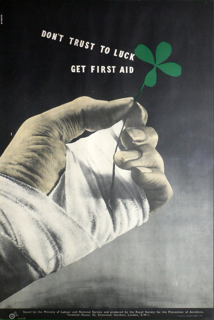
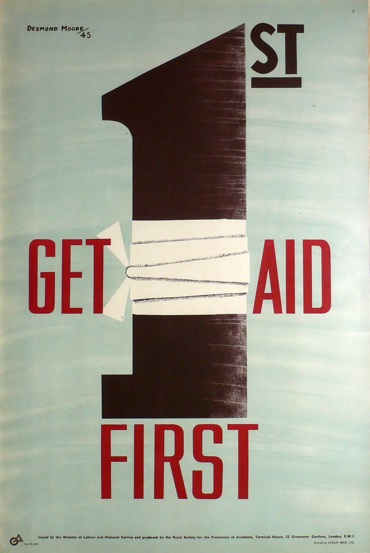
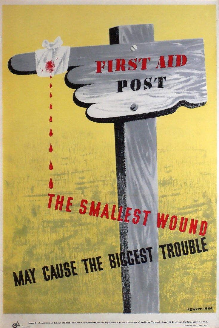
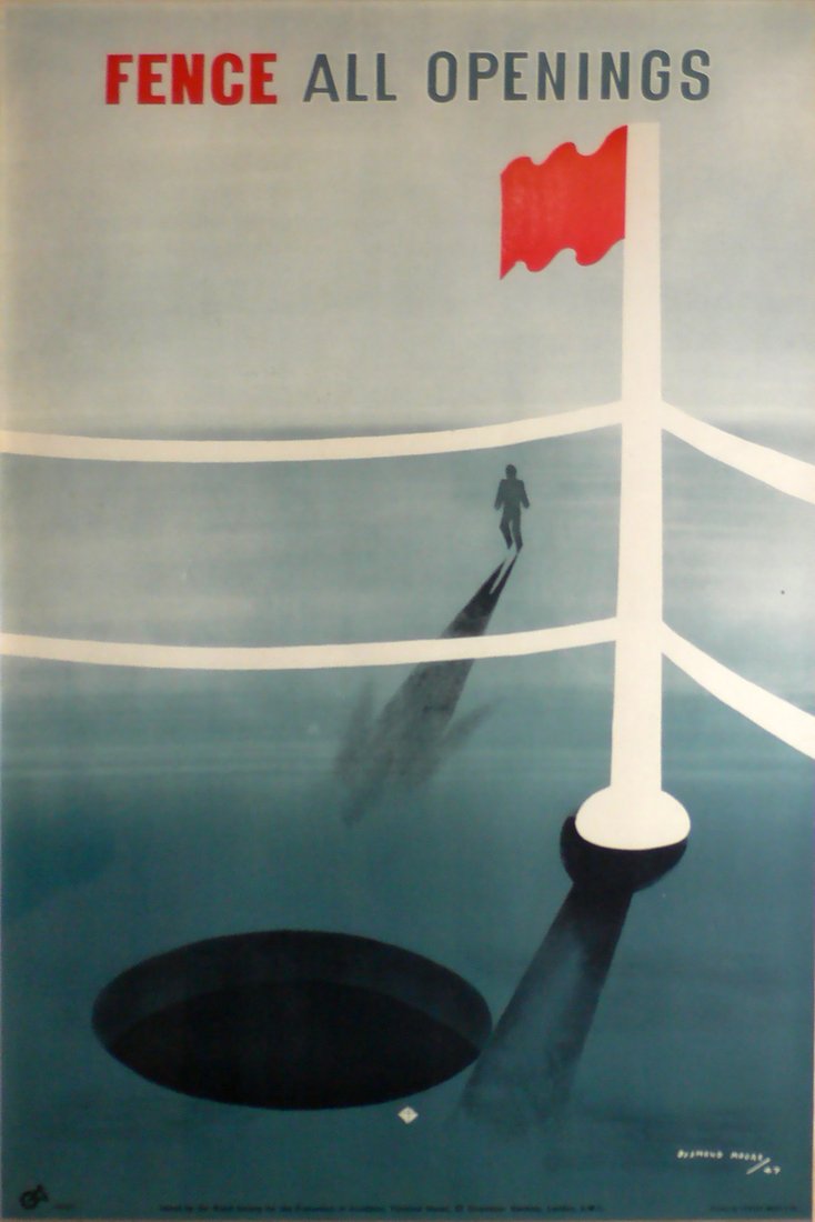
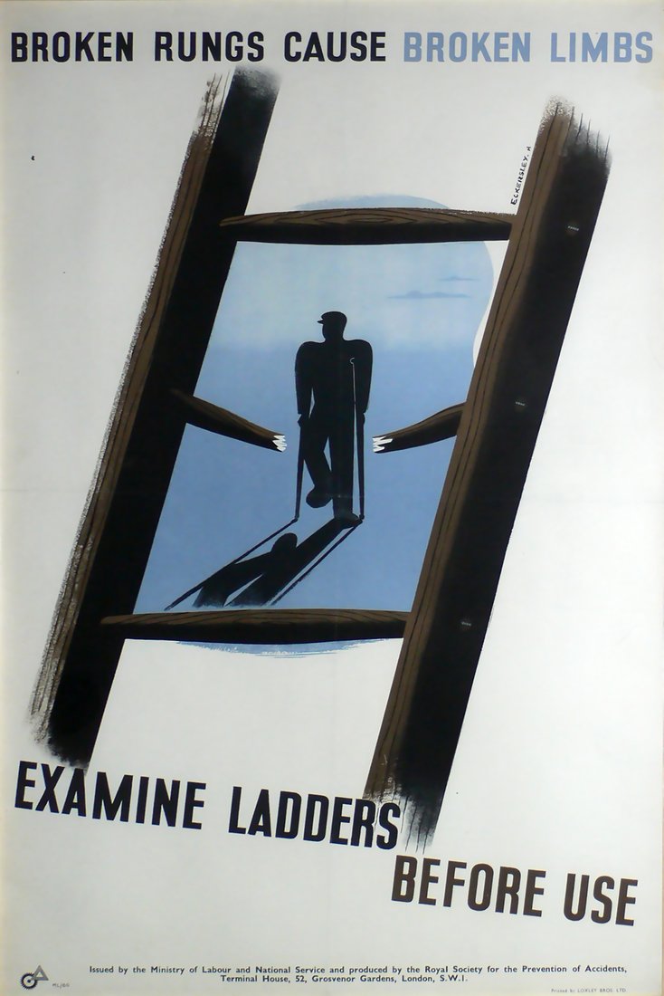
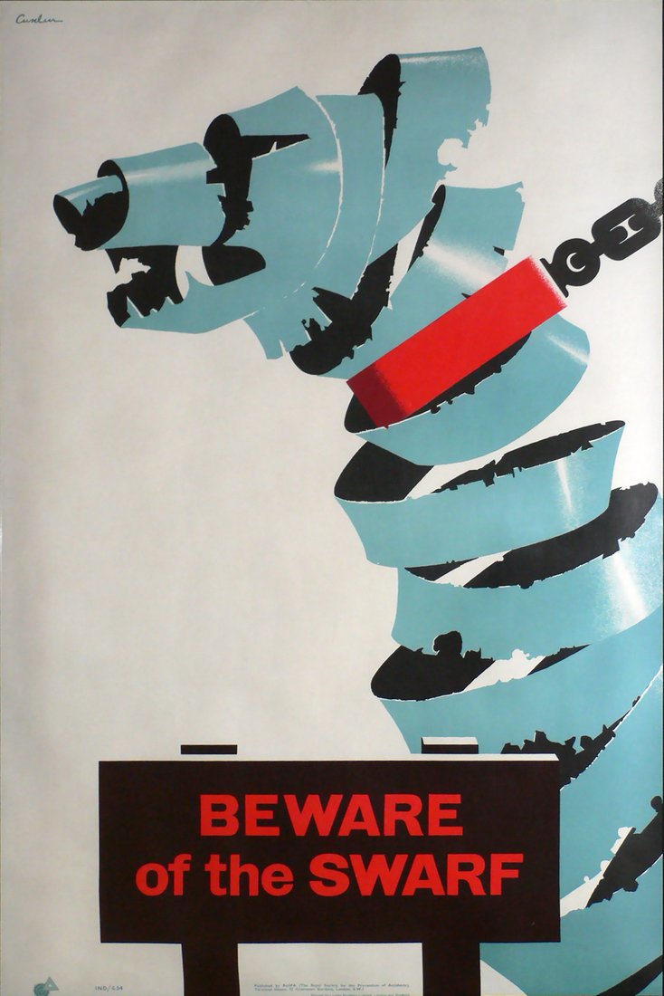
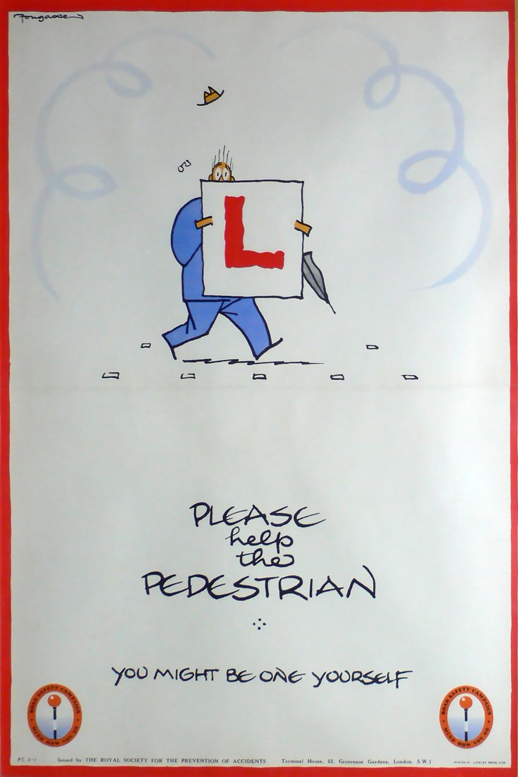
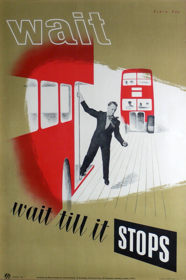
Like all posters, the RoSPA images were not intended to be saved. They were displayed in workshops and factories before being discarded. A few proof copies retained by designers and others involved in their production have survived, but are rare. Three categories of posters were produced to shape the industrial safety campaign: typographic messages, humorous illustrational designs—often featuring the enthusiastic but hapless worker, Percy Vere, drawn by Philip Mendoza—and pictorial posters addressing the various themes of factory and workshop safety. The effectiveness of the campaigns were built on the continuous repetition of simple messages. The principal themes focused on the issues of eye protection, appropriate work wear (especially in relation to shoes and hair coverings for female workers), the importance of cleanliness and tidiness, and consideration for fellow workers by discouraging horse play. Some of these themes bear comparison with the Mather work incentive posters for factories in the United States from the previous decade, but the explicit focus on worker welfare rather than production is specific to Britain.
The design merit of RoSPA’s WWII posters was recognised more or less immediately by an international audience. A selection of posters was even included in an exhibition of design at the Museum of Modern Art in New York. The review of British Graphic design, published by Graphis magazine (issue 14) in Switzerland during 1946, also included several examples from the campaign.

Conclusion
The end of hostilities in May 1945 marked the beginning of a new kind of public information associated with the communication of the ideas and ideals of post-war settlement, a return to order, and the rebuilding of Britain and its economy. The Ministry of Information became the Central Office of Information. The emergence of television allowed for a growing proportion of public information to be transmitted in soft form through the story arcs of weekly soap operas. The history of poster art in Britain is usually described in relation to a number of key design personalities and the patronage of various large organizations.
Until recently, RoSPA posters were understood as an interesting footnote to this history. The wartime industrial safety posters of RoSPA provide a unique and distinctive alternative to the messages and image culture usually associated with propaganda. The designers involved in the campaigns marked it as both modernist and progressive in terms of both style and values. These posters are historically significant in their own right as part of the Home Front propaganda of WWII in Britain. Furthermore, they evidence an embrace of modernist design thinking and production that provides a significant counter to the orthodoxy of a British resistance to modernism in general. They are significantly different in tone, focusing on safety and clearly distinguishing themselves from posters that incentivise production. Finally, because they involved the major British designers in the early stages of their respective careers, these posters provide a terrific opportunity for collectors to source modern images from interesting artists at appealing price points.
All images courtesy of Paul and Karen Rennie British design collection.
Images related to the article - click to see the full image and read captions